Building an immersive, activity-based shopping experience
Client YETI | Role Experience Architect
YETI Coolers was founded with a simple mission: build the cooler you’d use every day. One that is built for the serious outdoor enthusiast. To that mission, YETI tasked Capgemini with creating an ecommerce site that was as much about lifestyle pursuits as it is about products.
I worked with 2 talented creative designers to develop a new site navigation and build core shopping pages that blended commerce and content. I was responsible for collaborating on UX strategy, providing guidance for usability best practice, and developing test plans to validate our concepts.
The Approach
The UX strategy was very customer-centered. YETI is a lifestyle brand and its customers are very passionate about the brand & its products. We wanted the site experience to have the same attention to detail and be as delightful to use as the products themselves.
From a business perspective, highlighting the breadth of product offerings and encouraging discovery of new categories was a priority.

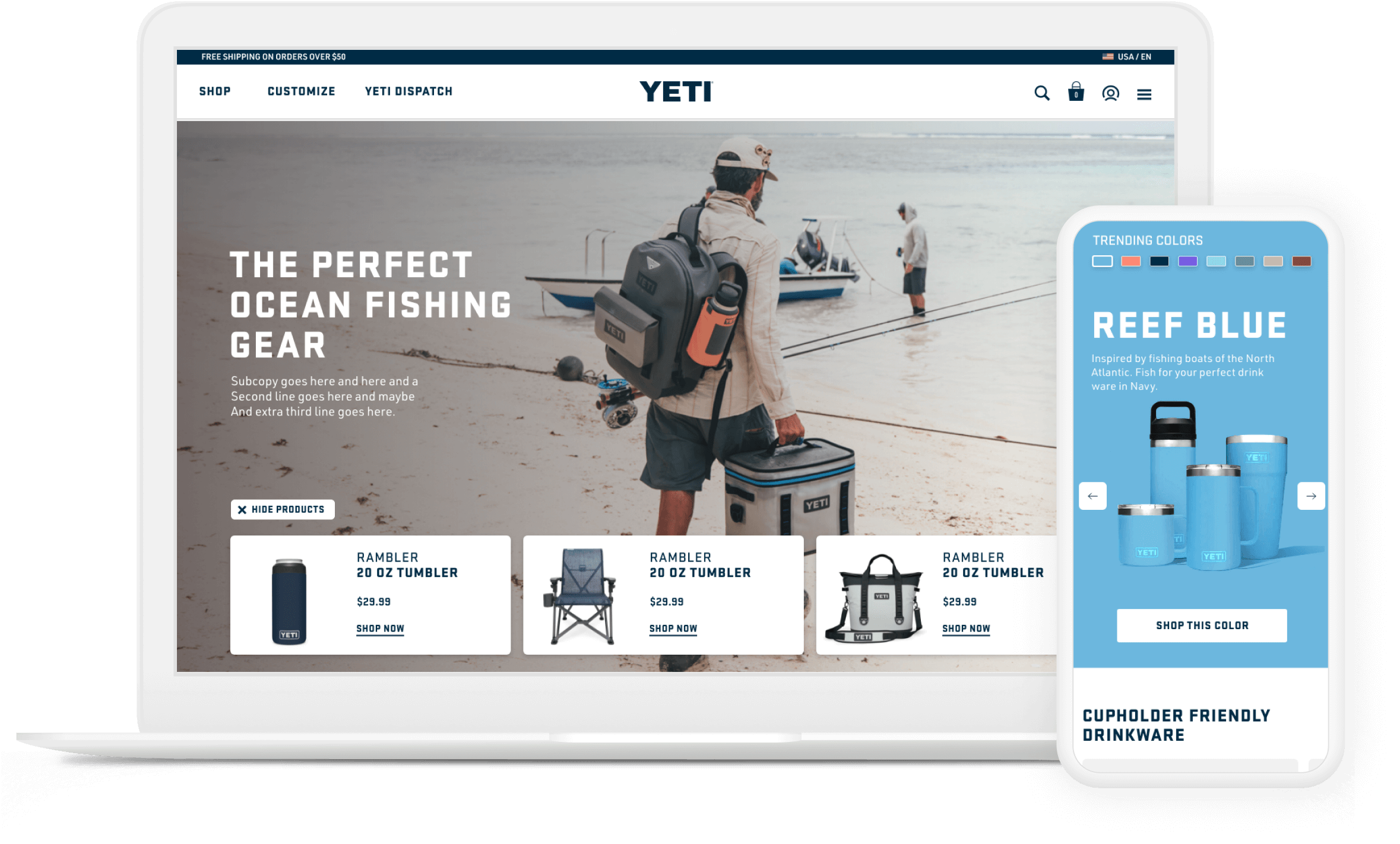
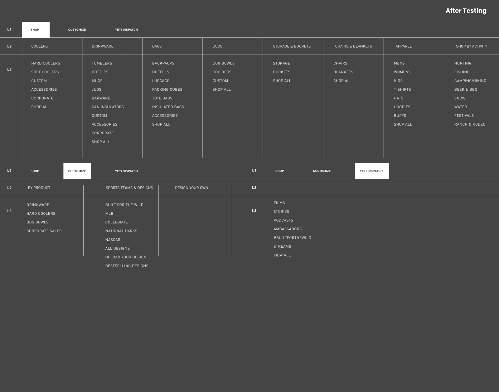
Re-imagined Navigation & Taxonomy
Incoporating the data from previous user research and analytics, we restructured the header and navigation to feature new ways for customer shop and think about YETI products and content.
Adhering to a customer-centric design approach, we conducted user testing to validate our new approach before giving it the stamp of approval.
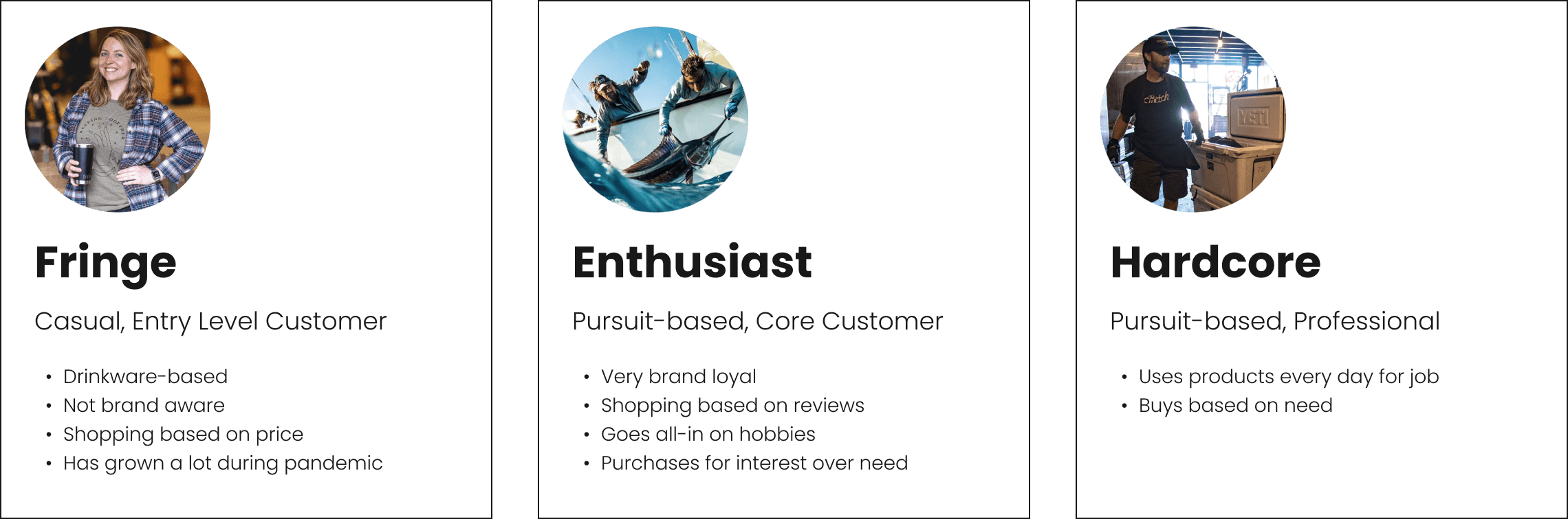
Customer Groups
The 3 core customer groups as defined by the client. A business priority was to find a way to move Fringe customers into the Enthusiast group.
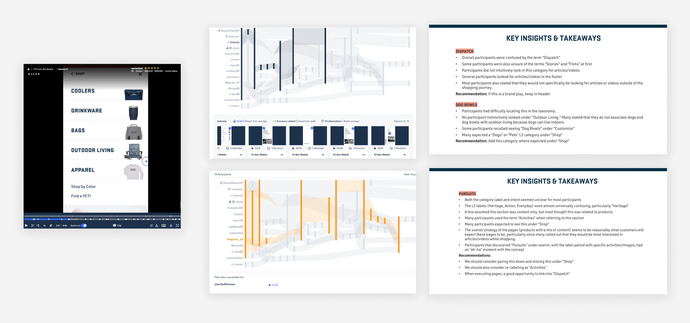
Usability Testing: Validating the Work
We conducted unmoderated usability tests to make sure customers were able to find what they needed. We uncovered some unexpected friction points that we took back to our designs to solve for.
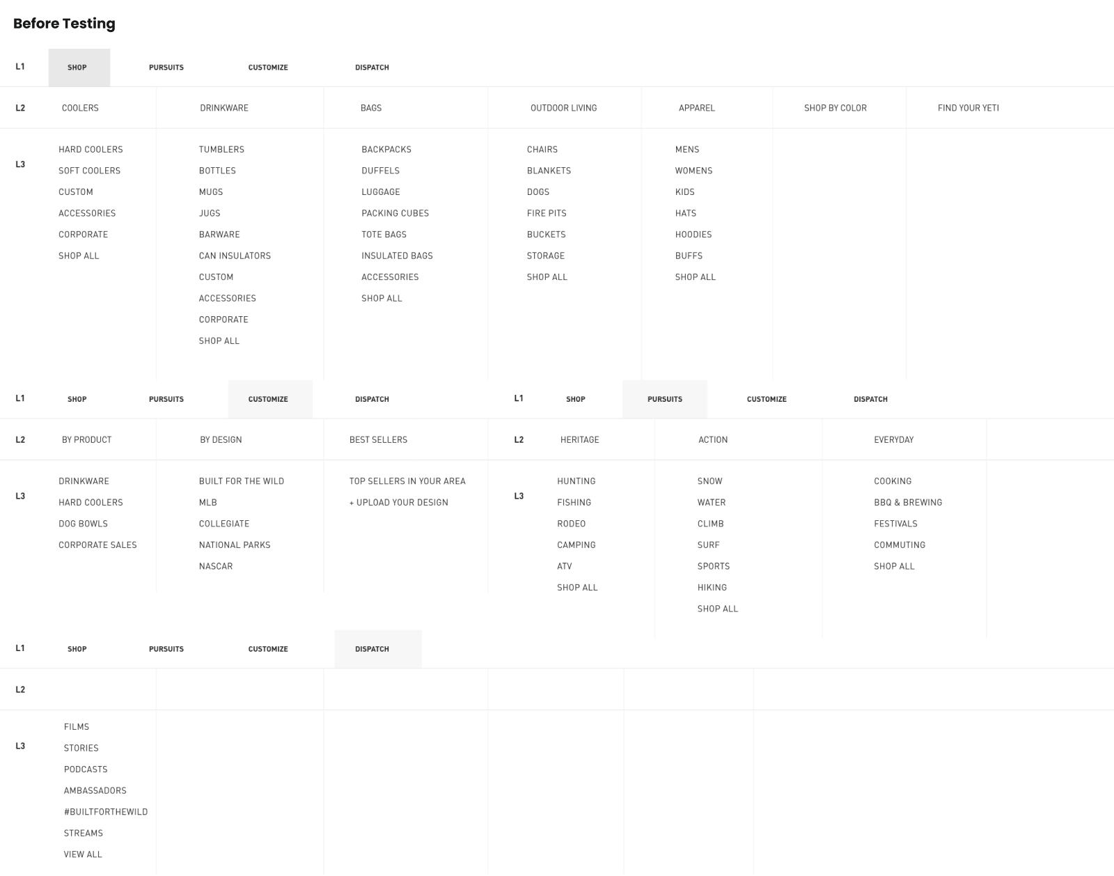
Taxonomy: Before & After
We developed the idea of nagivation by “Pursuit” separate from "Shop" for the customer to navigate the site by their interest vs product. During testing we discovered that the term “Pursuit” clear, causing participants to not explore the category. Once they understood the concept it resonated, but virtually all participants said the would expect to find this under "Shop."
Crafting the shopping experience for customer & client
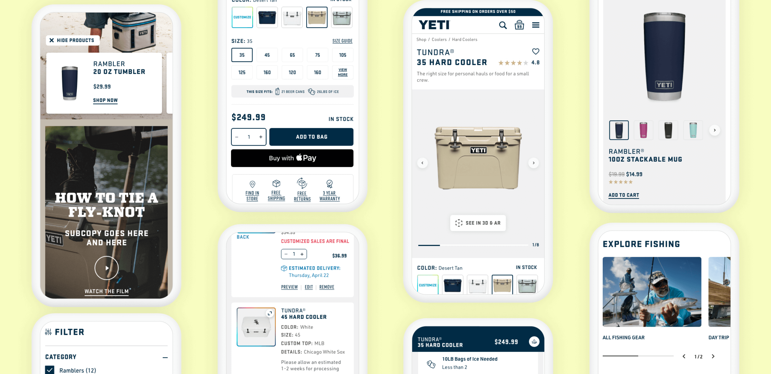
Key pages in the shop flow had a tall order to fill. They needed to tell the story of the product, give the user an immersive content-rich experience without being distracting, and deliver a frictionless shopping journey.
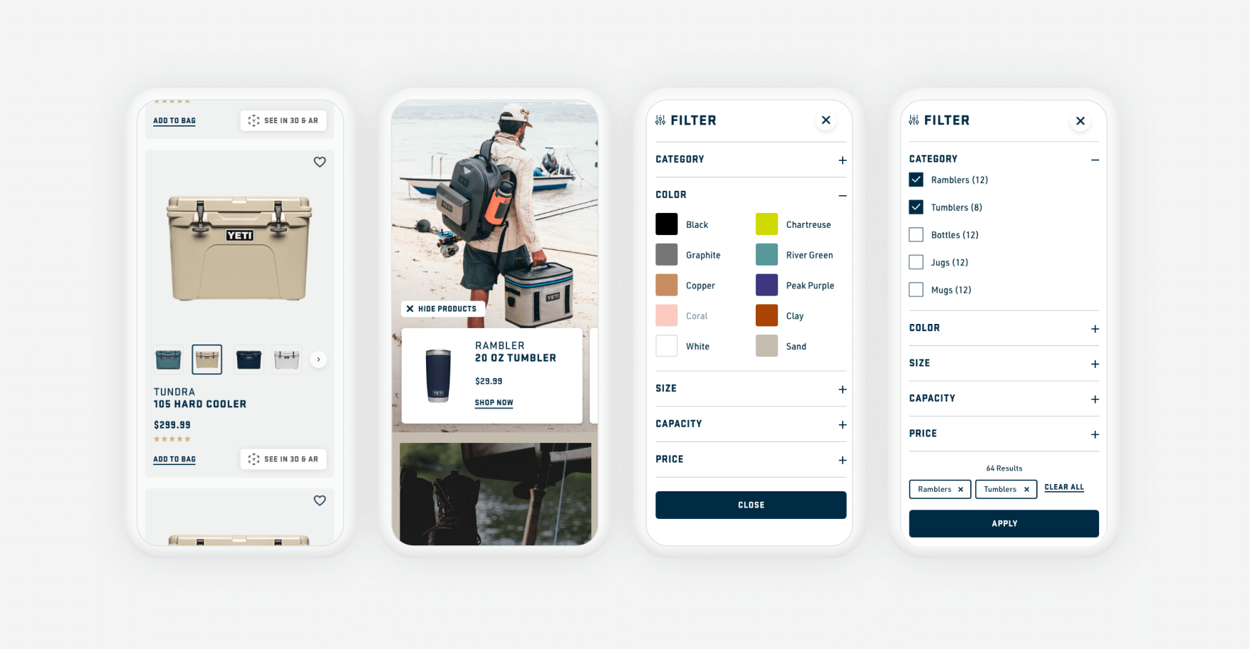
We acheived this by optimizing key features such as filtering, product tiles and adding to cart while developing a content design system. Seamless UX benefitted the customer and a modular design system created consistency across pages and allowed the YETI team to easily build and optimize new pages.
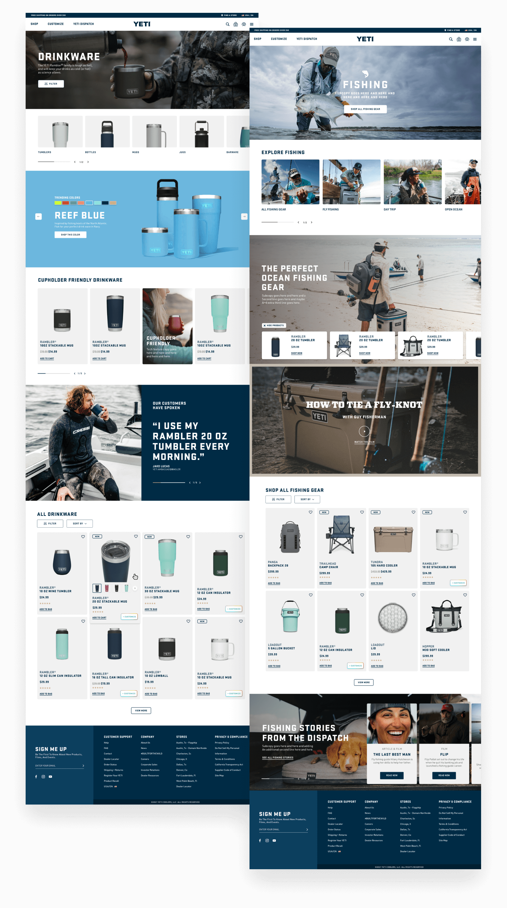
Category Browse Page: By Product & By Activity
To provide the most immersive experience, we developed browse pages that combine content and commerce and livened up what is typically a pretty boring, functional page. We tested these concepts with users and they loved the interactive nature of the Shop by Color and shoppable image modules. You can also see some of the concept of a modular design system in action on both of these page templates.
Category Browse Page: Details
This is a mobile-first responsive project, so everything that looks great on a large screen was designed to look (and function!) great on smaller screens as well.
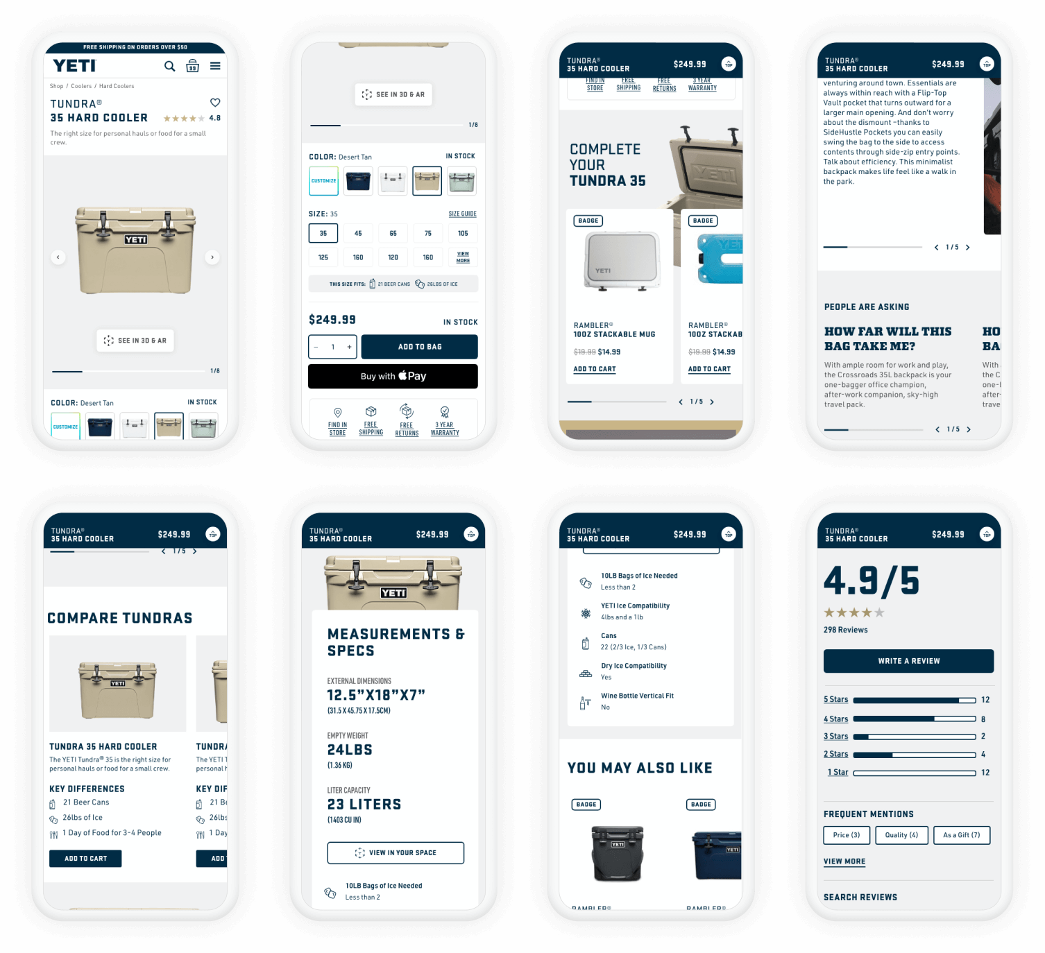
Product Detail Page: Mobile First
About 70% of YETI’s traffic is mobile so making the product detail page easy to use on your phone was non-negotiable. We made sure to incorporate best practice interaction & usability patterns such as finger-friendly touch points, keeping swatches near product images, and having price, availability & brand value propositions near the Add to Cart button. Features such as the ability to see in augmented reality, quick buy options, and iconography driven product specs were icing on the cake.

Shopping Cart: Optimized Experience
YETI’s custom products have a considerable amount of information and are final sale so it is important that the customer can check to make sure their customization is correct. We optimized this page to allow the customer to easily understand what they are getting and when, giving them the confidence to enter the checkout funnel and helping to boost conversion rates.
In Closing
This design-led project was challenging and fun. It was in the process of being developed when I changed roles so final impact is not known. Although if testing is any indication, this YETI redesign was a success.
Credits: Justin Delara (Creative Director), Sarah Oborka (UI/Visual Design), Brian House (Project Manager)

Thanks for stopping by, let's chat.
Talk to me
©2025 Sara Mehldau
Made for saramehldau.design by me, Sara