Increasing usability and elevating the brand with a UI & style guide refresh
Client Dylan's Candy Bar | Role Product Designer
Founded by Dylan Lauren, Dylan’s Candy Bar is a confectionery emporium and lifestyle brand with a mission to merge fashion, art and pop culture with candy to ignite the creative spirit and inner child in everyone that visits. Historically a strong brick & morter brand, the ecommerce site was still growing and developing.
As the only in-house UX/UI designer I had roadmapped a UI audit and styleguide refresh for the first half of 2017. The site had been redesigned in 2014 and it was time for refresh. The goal of the refresh was to refine the aesthetic and increase usability while maintaining the fun and whimsy that is the core of the brand.
Audit of existing user interface elements
It was important to document the current UI in order to see what was being used and where to assist the refresh, but also gain buy-in with stakeholders. Without in-house developers, any development project would have a cost attached and the audit would illustrate the value of the redesign.
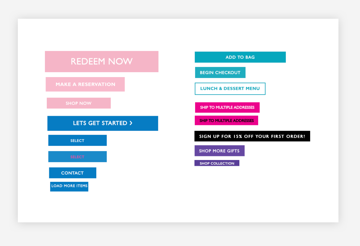
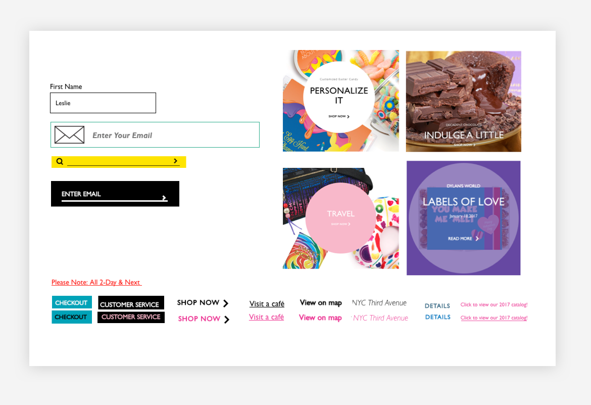
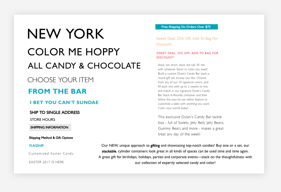
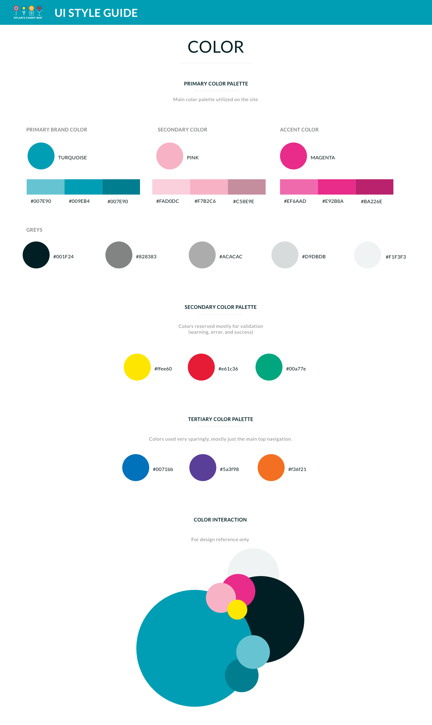
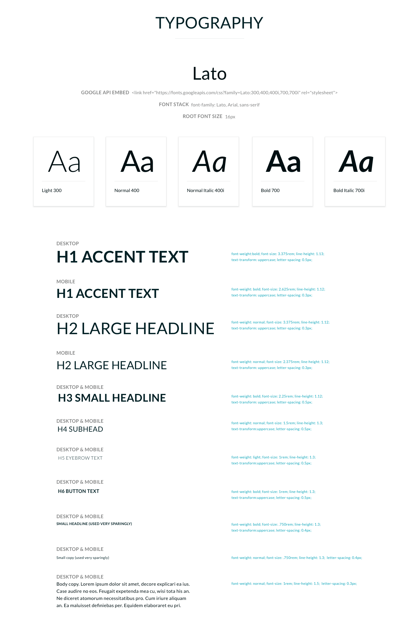
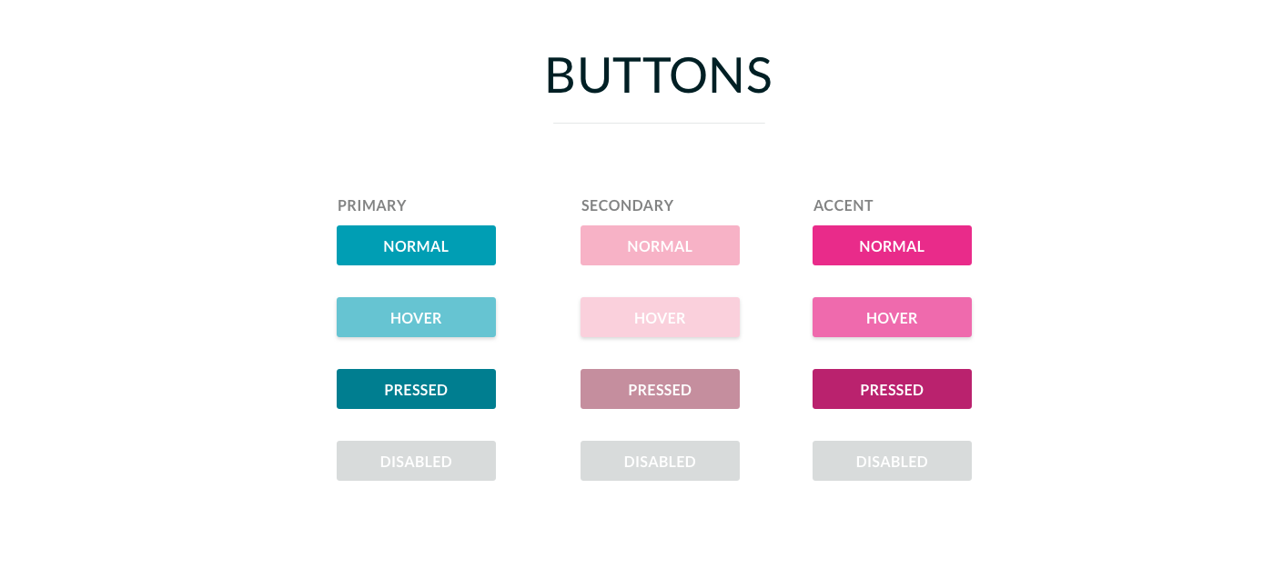
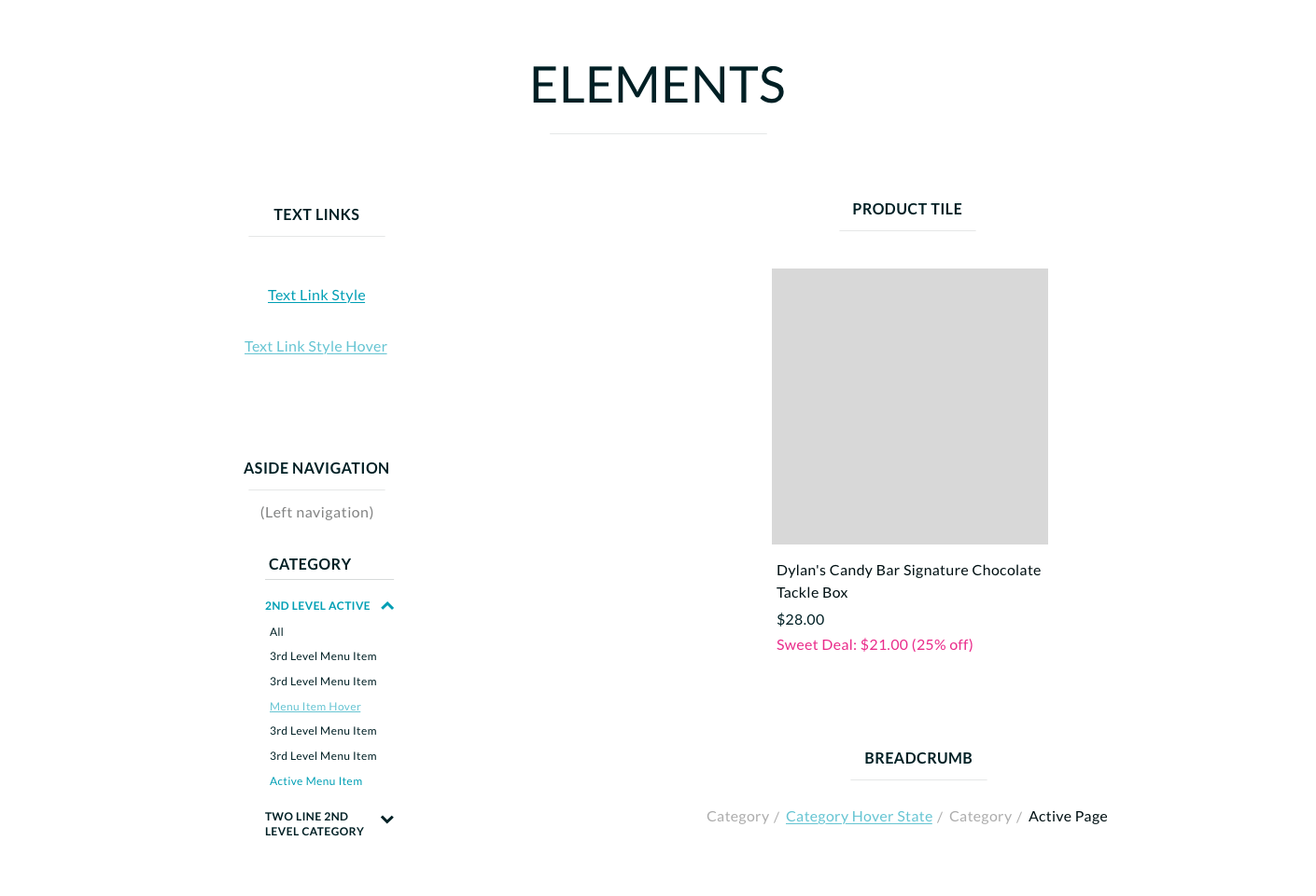
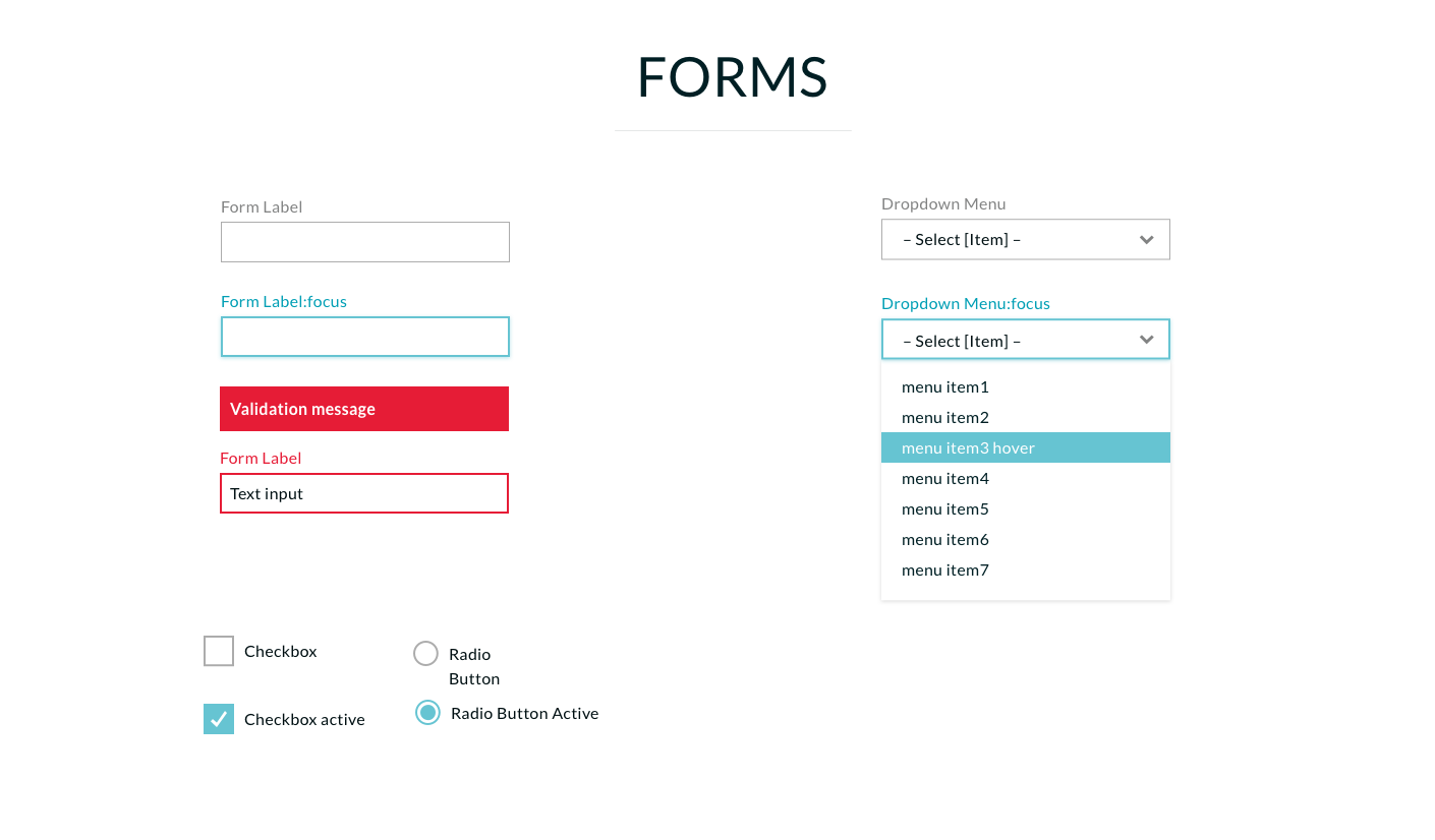
Refreshed Style Guide
The focus was to simplify elements and create an overall simplicity to the UI. The brand font did not render well in browsers so I chose to move to a Google font that increased legibility but retained the brand essence. I established rules around color usage, text links and buttons, and streamlined form fields.
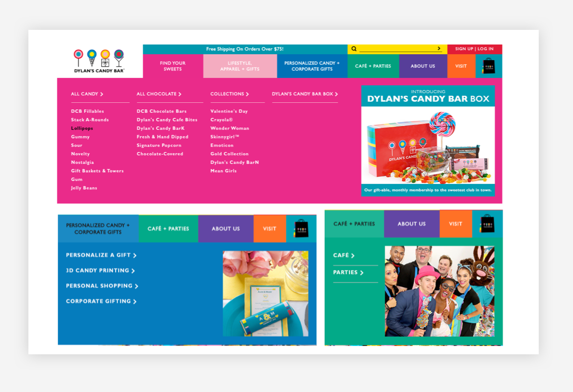
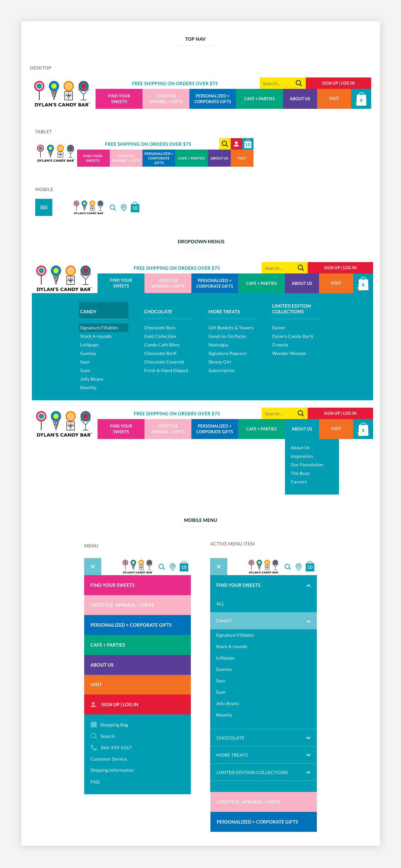
Navigation UI and Homepage
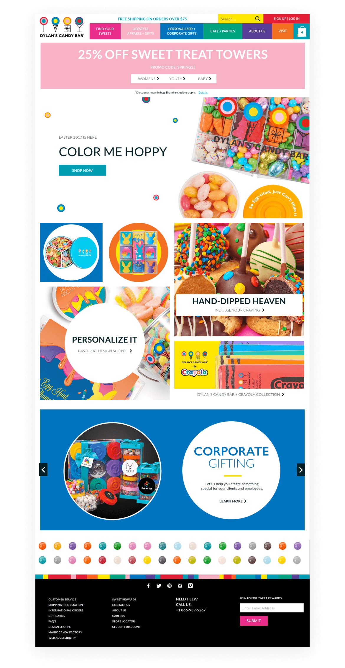
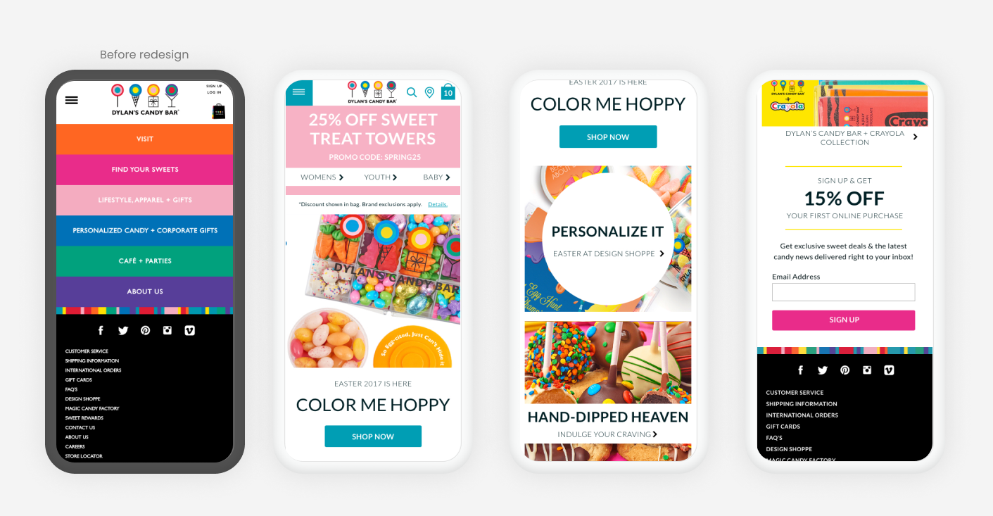
I kept the existing multi-colored header to maintain the playfullness of the brand, but unified the dropdowns into a single, more user-friendly color palette & itneraction pattern. Dylan's customers are super promotion-focused, so in addition to cleaning up the typography on the homepage, I added a large promo spot at the top of the page. It larger than the typical site text-based promo, but we knew our customers would skip right over it otherwise. On mobile, the current site had no mobile homepage (!) so adding in content was a huge value add to the experience.

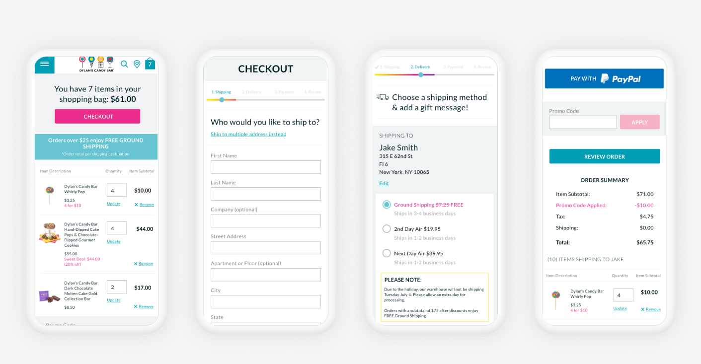
Future Facing Checkout Concept
As part of the refresh, I pitched a redesigned checkout experience to stakeholders. According to analytics, approximately 35% of shoppers were over the age of 50. The current checkout experience was clunky and confusing causing friction and abandoment for less tech-savvy shoppers. I wanted a friendlier, conversational interface to thelp guide users. Ultimately this did not get off the ground due to budget.
In Closing
The end deliverable of the project was a living style guide. At the time, while tools such as Zeplin were becoming more mainstream for developer handoff, it was not in the budget so I needed to find a work around. I discovered a sketch plugin that generated an html output with inspector capabilites and was successfully used by our developers to implement the refresh.
Post-refresh we saw a reduced bounce rate, a bump in conversion, and a reduction in customer service calls related to site usability.
Credits: Kevin Cohen (Ecommerce Manager), Acadaca LLC (Development)
Thanks for stopping by, let's chat.
Talk to me
©2025 Sara Mehldau
Made for saramehldau.design by me, Sara